The sun rises on a dynamic institution

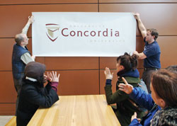
Students discuss Concordia’s new logo, which combines the triangle and book of Sir George Williams University with the rising sun of Loyola College. Facilities Management employees help out by holding up the new logo: Steven St-Arneault (left) and Andy Syvret.
Kate Hutchinson
Concordia is presenting a daring new face to the world. The stylized shield that has been on advertisements, signs, stationery and brochures for the past 19 years has been replaced with an image that speaks of tradition in a contemporary voice.
The logo combines three elements that are on the shield— the open book and mind-body-spirit triangle associated with the YMCA and its founder, Sir George Williams, and the rising sun of knowledge that symbolized the Jesuits’ Loyola College.
In preparation since the summer, the logo was approved by the university’s Board of Governors on Jan. 18.
The Montreal media appear to approve. For Le Devoir, the most striking thing was that the logo’s text is bilingual — “Université Concordia University.” President Claude Lajeunesse told the influential newspaper that the choice of a bilingual sign shows “we’re engaged in Montreal’s milieu, which is francophone.”
The groundwork for the project was laid through reputation surveys of a wide sample of stakeholders within the Concordia community and beyond. (See Journal, Oct. 26 ).
Two outside design firms were retained. They and the university’s own designers created 120 visual ideas that were gradually narrowed down to a handful. After extensive consultation, including about 40 one-on-one interviews with representative students, professors, staff, senior administrators and governors, the final choice was made.
Marketing Communications Director Sami Antaki said the design work cost about $30,000 — by the standards of the advertising industry, virtually pro bono. Because both firms were headed by alumni, “It cost about one-tenth of what someone else would charge.”
Antaki said the choice of the new symbol followed what the surveys said people think of when they hear “Concordia” — and on what should be added to that mental image. People think Concordia is innovative, diverse and approachable, which it is. We also want them to think “quality” when Concordia comes to mind.
You’ll soon start to see the new logo in transit and newspaper ads, in brochures and other promotional material, and in the Concordia University Magazine and the Journal.
Schools, institutes, centres and departments with their own look will be expected to integrate their image with the new logo, in print and on the web, but Communications Advisor John Parisella assured them that they will be given all the time and assistance they need.
The logo is in garnet and gold. This red is darker than you may have seen before, a sophisticated deep burgundy designed specifically for our use. Like the colours, the university’s bilingual name is in a font that is exclusive to Concordia.
The logo has a close cousin called the “graphic signature.” The open end on the shield of the book-sun-triangle image is meant to accommodate text, such as the name of a department, but Antaki said the logo design is quite flexible, and can be used in innovative ways.
Elana Trager, Brand Development Coordinator in Marketing Communications, is developing a booklet of standards and guidelines for using the logo and the graphic signature that will soon be available for consultation on the web.
She’s the go-to person for all your questions (ext. 4898), but here are some that might spring to mind:
Do we have to throw out all our letterhead? Certainly not! Just use it up. The new templates for stationery items will be in the university’s Digital Store. When you have used up your supplies, contact them, and they’ll take care of the rest.
Will it cost a fortune to replace all the university’s signs and shuttle bus decoration? No again. The City of Montreal will help finance Quartier Concordia’s new look. Other signage will cost about $50,000 and has been accounted for in the university’s budget. The shuttle bus’s decorative “skins” have been in place for six years, and will soon be due for replacement. The Stingers varsity teams will replace their helmets and uniforms as needed.
How long will it take to make the logo’s transformation complete? Probably about 18 months.
How many logos has Concordia had? This is the fourth in our 33-year history.
Does the new logo replace the university’s coat of arms? No, the heraldic coat of arms remains. (For more on that subject, go to ctr.concordia.ca/archives/is130100/art31.html.)