New Concordia home page a first step

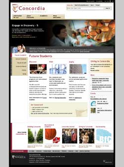
This mock-up of the new home page provides a glimpse of things to come.
The new Concordia home page that will be rolled out in a few weeks is the first phase of a project to give the university a distinctive, dynamic and highly functional presence on the World Wide Web.
In the past, web sites have been developed without much coordination. University Web Communications Coordinator Simon Horn says that sites were designed in a wide variety of styles, language and architecture.
Over the last 12 months, Web Communications has developed and presented widely a vision of a user-centered website to deliver information, services and persuasive Concordia stories, especially to potential students who use the web to scout universities and whose expectations are very high.
“Give the users what they want, where and when they want it” is the idea behind the vision, which was presented to the senior administration and members of the university in the academic and service areas.
A strong proponent of this approach was Web Producer James Allison, whose background is in user experience analysis. Allison says the redesign project has not just been about the layout of the home page but also providing a framework for all of Concordia's web presence.
Much of the traffic comes via search engines, so visitors are landing on specific pages across Concordia's web sites. The page for a specific program or department might not situate you within Concordia and not provide links to find your way to the information you need. “They may not know what faculty they’re in, or even be able to tell that they’re at Concordia.”
Web Communications is also working with the faculties to renew their home pages using the same underlying design and navigational elements as the main home page. Eventually, each layer of pages will have a common look and feel, while still permitting university departments and units to express their distinctive personalities.
Web Designers Rommil Santiago and Mathieu Vo-Quang have designed a template to enable sites to be renewed to complement the new home page. The redesigned main site and the template follow the guidelines of Concordia's new visual identity. The use of the new logo and signature will create a family resemblance across the university’s many sites. The templates are available from Web Communications.
In developing the template, the university’s web team had invaluable help from members of the Web Forum, an informal group of up to 50 employees from across the university who have responsibility for the content, technology and/or design of their departments’ web pages. The Web Forum meets roughly once a month to discuss subjects of mutual concern.
The new home page marks the beginning of the next stage of the project, which will further integrate the services and information offered on the website.
Laurie Zack, Director of Internal and Web Communications, says it’s a work in progress: “We’re going to fine-tune and test the home page through the summer. We want to know what users think.”
The goal is a seamless institutional site that delivers targeted information and useful interactive features to internal and external audiences so that we attract new students, professors and researchers. It will also mean developing tools to ensure the flow of accurate news and information across the university site.
“The way to achieve this integrated web presence is to work together. We’re on our way,” Zack concluded.